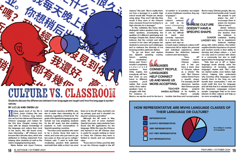
Page Designs
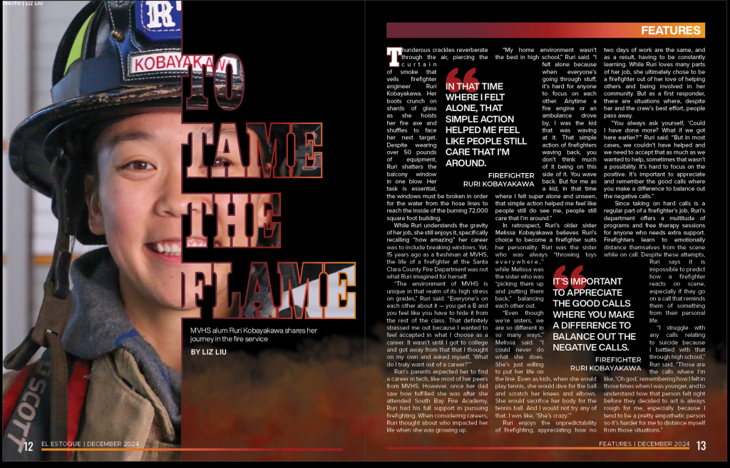
I approached my fire station story with both the written story and its design in mind. Inspired by a powerful photo-based design I found in the previous cycle, I intentionally framed my photos to align with my vision. After hours of work—and multiple setbacks from losing unsaved progress—I refined the design. I sought feedback from experienced artists to create the flame visual at the bottom of the page and found the balance between brightening the page without taking attention away from the text.
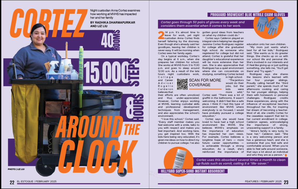
I have been shifting towards photo-based designs because features should focus on people. For my story on Cortez, I knew I wanted her as the main focus, so I brought a camera to her interview and took a variety of shots—full body, upper body, facing different angles. My co-writer and I found a design we liked for inspiration, but it was hard to replicate due to the differences in photo types. After getting feedback from friends for my initial design, I experimented with the rectangle positioning, which led to the idea of rotating the rectangles all sideways. I chose orange and blue for their strong contrast.